There are many types of brochure out there today, so deciding to create one that leaves an impact can be challenging. It should be something that stands out in your industry, shows off your brand and entices readers.
It’s not a walk in the park. But by remaining collaborative, creative and critical, you and your team can design something worth talking about. Here are our 13 top tips when it comes to absolutely nailing a brochure design.
- Streamline Your Purpose
- Know Your Customers
- Determine a Stock Type
- Think About Fold Format
- Identify the Right Font...
- ...and Use It To Enhance Killer Copy
- Create a Flat Plan
- Find the Best Images
- Choose a Colour Scheme
- Don’t Be Afraid to Experiment
- Get a Second Opinion
- Make It Something Worth Keeping
- Explore Different Printing Techniques
1.Streamline Your Purpose
What is your brochure for? Answering this question helps you and your team find the brochure’s purpose. Are you advertising an event? A line of merchandise? A range of services? Or are you simply creating a brochure to talk about industry news? It could be any of these or a mix.
The design of a brochure needs to accurately represent the purpose. This can seem hard to define but bad design is something you’ll know when you see it. By finding a purpose, you can create a list of things the brochure should have.
A brochure is all about communication. Every decision you make will either enhance or detract from communicating with your audience.
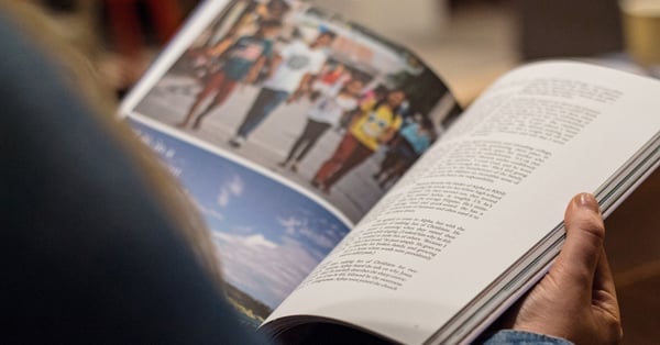
2.Know Your Customers
On the subject of the audience, make an effort to know your customers. While you may have good knowledge of your buyers, it’s worth going over it to try and fill in any blanks.
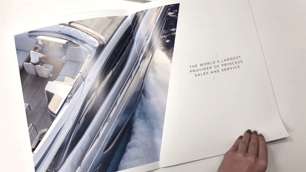
If your brochure involves food, drink or lifestyle, choose designs that provide a balance between imagery and text. Look at this brochure from Princess Motor Yachts - it’s hit that sweet spot of knowing exactly who its clients are. Great images, catchy copy and a luxury feel - exactly what you expect from a yacht company.
If you’re unaware of your customer types, talk to your sales department. Their customer-facing knowledge and experience will provide a wealth of data you can incorporate into your design choices.
-1-1.gif?width=600&name=ezgif.com-gif-maker%20(1)-1-1.gif)
3.Determine a Stock Type
Stock (or paper) type, is crucial. While most brochures use gloss-coated paper to create a professional feel, more and more companies are choosing to go down a more textured and unique route. They’re beginning to use paper types such as uncoated or matte-coated paper, which don't have the glossy sheen or regular brochures but still have an intense visual appeal. It also creates an incredibly eye catching contrast when paired up with spot UV varnish.
Paper types can also vary in price, which can determine the overall cost of your brochure design. In turn, this affects how long the final product will be, as it’s most economical to print in pages that are divisible by four.
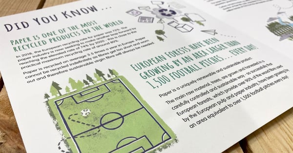
For the eco-friendly amongst you, consider Carbon-Balanced paper to limit your environmental impact.
If you’re interested in learning more about paper types, check out our guide to stock here.
4. Think About Fold Format
A brochure doesn’t have to be a bi-fold booklet. You can do a lot with fold designs that can really make your brochure stand out, enhancing the style to something that’s more fun to feel and open than usual.
You could try a tri-fold brochure or something with a bit more pizzazz. Look at this fold for Sheffield City Region - who said a brochure has to be a booklet?
-1.gif?width=593&name=31W%20-%20Sheffield%20City%20Region%20(1)-1.gif)
This is something you can determine with an experienced print provider.
5. Identify the Right Font…
Font choice can make or break a brochure. Sometimes, they can be incredibly unique and visually-entertaining and other times they can be more conservative. Each of these types is valid - it all depends on what you’re using it for.
A luxury brochure featuring bespoke watches will probably restrain from using graffiti-style lettering, whereas a street fashion brochure may find the use of it beneficial. Check out this brochure example for a great use of two fonts. They’re not over-the-top, they work well together and they fit the tone and style of the overall piece.
A brochure shouldn’t use tonnes of different fonts - keep it down to a minimum of two or three. One for the main body of text, another for subheadings and titles. Keeping to these helps to establish a brand identity within your brochures.
6. ...and Use It To Enhance Killer Copy
A font choice is only half the battle. Without killer copy, it’s no use investing in quality typography.
Great copy is consistently the most undervalued component of brochure design. It’s the vehicle for your marketing communication but if it’s not well-written, compelling or in the right voice, it will put people off.
If you’ve got great images but terrible copy, your audience will notice. Before planning, write your content and keep it concise. You only have a certain amount of space for text within brochure designs, because a lot will be taken up by imagery, titles or guttering.
You also need to put the time and effort into editing and proofreading. Honestly, it’s the worst feeling in the world getting a print-run of 2500 brochures and finding a spelling mistake. Set up a proper workflow of writer - proofer - editor - this will make sure any mistakes can be spotted and set right.
7. Create a Flat Plan
Any magazine, brochure or leaflet needs a flat plan. This is a crucial part of brochure design. It's a document that contains small representations of your pages. Each of these will include a simple layout of what that page will include.
A flat plan is the perfect way to visualise how your brochure will come together. It’s simple to create on a Word document or by using Adobe InDesign. You can even create a physical one that people can all see by taping A4 sheets to a wall in your office.
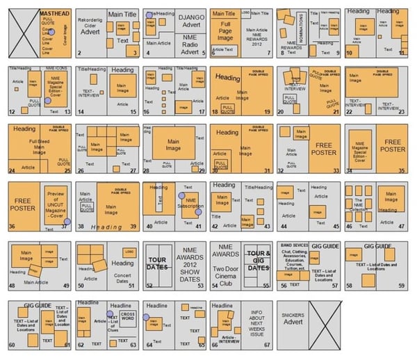
Credit: Medium
Without a flat plan, your initial brochure designs will be dead in the water. Using one helps create an efficient workflow, showing which pages are finished and which still need work. It also helps plan the flow of the brochure, showing which section works best in what position.
8. Find the Best Images
A brochure is only as good as the images you use. Now, the quality of an image can be determined by the size of a budget - as stock photo sites are liable to charge for each picture. However, not all will be super-pricey.
There are also free stock image sites to use, such as Unsplash or Pixabay. If you have any images of specific products, use them. If not, it’s simple to set up a photo-shoot to get the best visuals out of your products. With a good DSLR, natural lighting and minimalistic backdrops, you can capture stunning photographs yourself.
Images are important. When it comes to sourcing them, try and cut costs, never corners. Also, it’s crucial to get a high resolution image. A low resolution picture will look bad, even on the best quality paper.
9. Choose a Colour Scheme
Colour schemes tie a brochure together. They can create signature styles that help your brand become recognised. If you have company colours already, riff on them. A brochure doesn’t have to match these colours completely, but it should complement them.
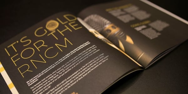
For example, check out this lovely edition of Northern Magazine. With a strong contrast of black and gold, it’s truly eye-catching. Plus, the gold is actually reflective foil, making those points of text and design really POP from the page.
Colour schemes also give you the chance to be a little more creative. But remember to choose a CMYK colour model over RGB when creating your colour schemes.
10. Don’t Be Afraid to Experiment
Creativity and experimentation set your work apart from the rest. Designing a brochure is the perfect place to trial new ideas out. Don’t worry about making mistakes. During the design period, new ideas can be trialled within the team to see if they’re worth using. Also, an experienced print provider can usually give feedback on what works and what doesn’t.
Because brochures are a saturated market, it’s worth creating something that is unlike the others in your industry. To help in your design, make an effort to get a copy of other brochures. What makes them similar? Do they have the same design features? What makes certain ones stand out?
11. Get a Second Opinion
All designs have issues that need solving and the best designs can’t be done alone. That’s why a team that offers second opinions on choices is the best way to go.
It’s worth having regular meetings to discuss the choices and progress of your design journey. This is the only way of creating something that makes everyone happy.
12. Make It Something Worth Keeping
When we say ‘something worth keeping’, we mean something you could keep on your shelf or coffee table, rather than something to be thrown away. Make your brochure a statement.
Combine all of the above qualities - good content, font styles, designs and tactile quality - to make something that is truly hard to put down. It needs to be visually appealing, useful and even feel good when you pick it up.
Also, think about the outside back cover - this needs to be just as eye-catching as the front. If it’s face-down, having an engaging back cover can still draw plenty of interest.
If your brochure is mainly product-based, make sure to add in evergreen content and contact information so that people are less likely to throw it away.
13. Explore Different Printing Techniques
There are many printing types and they all have their own benefits. However, our favourite ones are those that have the lowest environmental impact - digital printing and LED UV.
LED UV has a lower footprint than a conventional printing press because of superfast ink-drying times and no use of harmful drying chemicals. The fast drying time, made possible by the use of ultraviolet light, helps to retain the bold colours of images, graphics and text in your brochures. It’s the perfect way of creating pieces that look good, feel good and do good.
If you’re looking for more ways to create less environmentally-impactful print, you only have to scroll down a little further to find out how.
Use Our Green Printing Checklist
Our checklist to green printing is a way of determining how to create eco-friendly print solutions. It covers things like ink and paper types, printing techniques and even sustainable print companies. The more you tick off the checklist, the ‘greener’ your print will become.
Click here to download the Green Printing Checklist today.