Process and spots colours are the two most widely accepted colour forms used in the printing industry. Whether you want high-quality, durable business cards or beautifully tactile soft-touch brochures - you’ll use one or the other for your printing project.
Both determine the printing method, overall appearance, impact and budget of your project so it’s essential to understand the distinction. But what actually are the differences between spot vs process colour?
- Process Colour
- Spot Colour
Process Colour

We’ll start with the most common method. Process colours are reproduced by separating the file into CMYK. If you’re not familiar with the print lingo, the image is printed with a combination of the four standard colours: cyan, magenta, yellow and black.
When these colours are used in different combinations, quantities and densities, you unlock millions of colours. The spectrum of process colours also achieves several unique colours.
Now for the technical side. When reproducing a colour image, it’s separated into four standard colours. During that stage, screen tints of small dots are applied at different angles for each of these colours.
The separated colours are transferred to four different printing plates (each plate for one colour) and then printed individually. Each plate with a colour then overprints the next and creates a composite image. The dots are so tiny that they create an illusion of continuous tone for the naked eye.
However, it’s difficult to match and maintain colour consistency with process colour printing unless you work with an expert printer with a high quality LED printing press. So just keep that in mind. On the contrary, process colours (CMYK) are ideal when:
- Your project requires full-colour images and photographs.
- Your printing project includes multi-colour graphics that would need several (expensive) colours of ink when printed with spot colours.
- You want to print for short-runs on a budget.
Spot Colour
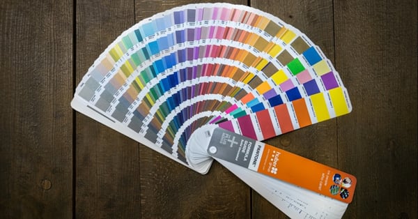
Spot colours are created without screens or dots. They're found in the Pantone Matching System (PMS).
Spot colours are produced when inks are laid down in a single run. The image printed is of pure and mixed inks without separate screens or multicolour dots. Plus, this technique allows you to enjoy an even wider selection of colours to choose from than the CMYK method.
With this method, each colour requires a separate printing plate and press to print designs, so it can be a little more expensive than process colours. Another reason why it can become more costly is that the machines have to be washed down in between to clear any ink residue. Unless you have a huge order, it might not be cost effective.
But the image produced using spot colours is vibrant and provides more even coverage compared to its counterpart. You should opt for spot colours when:
- You want to produce the exact same colour of your logo to reinforce brand identity (For example, the vibrant duck egg blue from Tiffany & Co has become synonymous to its brand and is used by the company for marketing on various platforms).
- Your project leverages special printing techniques such as metallic spot inks.
- Your project requires colour consistency on multiple or all pages.
- You want to produce unique colours that CMYK falls flat on.
Which One Shall I Use?
We’ve given you some examples of when to use process vs spot colour in each section but we’ll recap for ease. If you want to achieve the exact colours of your logo or guarantee colour consistency on all your projects, you should consider spot colour printing.
On the other hand, process colour printing should be your preferred choice if you want full-colour printing involving several colours.
Sometimes it’s efficient to use process and spot inks on the same project. For example, you might use one spot ink to print the exact colour of your logo on the same pages of a prospectus where photographs are reproduced using process colour.
If you need any advice or guidance, reach out to your print provider. They’ll have all the insight so you can focus on creating compelling designs that resonate with your customer.
Although knowing the printing world inside and out is a challenge, there are handy guides available to make creative print uncomplicated.
Create Compelling Print Materials That Wow Your Customers
Process vs spot colour. JPEG vs PNG. Emboss vs deboss. Print is still a prominent victor in today’s marketing world and direct mail campaigns continue to cut through the digital noise.
That's why we created our Business Printing Guide. It highlights just how important print can be in today’s modern world, along with other vital steps you need to take beforehand to make your business printing spectacular. Learn about how print can be effective alongside your digital efforts by visiting the resource below.