The right printed leaflet can wow an audience and tell a reader exactly who your brand is. It’s a fantastic way to deliver a great first impression of your business.
Below are four awesome leaflet designs that are packed with killer features which are sure to get everybody talking about your brand and products. Enjoy!
Your leaflet should be/have:
- Bright and Full of Positivity
- Striking, Engaging Photography
- Interactive Engineering
- Big, Bold and Clever Typography
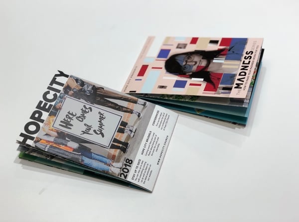
1. Bright and Full of Positivity - Hope City Church
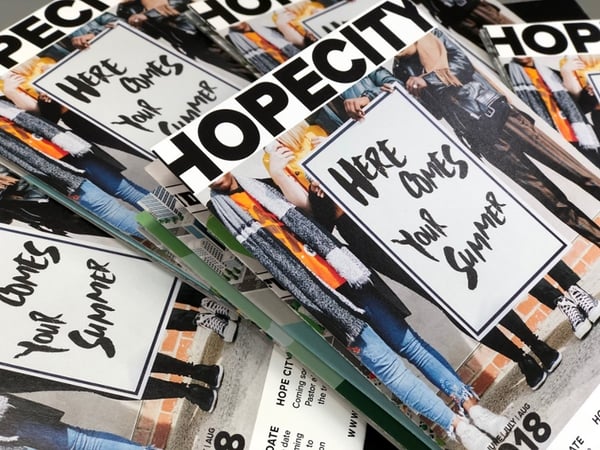
This leaflet by Hope City Church is a true reflection of their people. It’s bold, bright and full of positivity. It’s a really well thought out piece of printed marketing and provides readers with key information and dates, while keeping them hooked and engaged with its creative and funky design.
The leaflet folds out into eight main quadrants. This unique design is not only great to look at, but it’s also packed with information without it ever feeling cluttered and over-crowded. A text-heavy leaflet is difficult to read and more likely to end up in the recycling bin.
.gif?width=600&name=ezgif.com-crop%20(2).gif)
The LED UV print really emphasises the details within this slick leaflet and the unique folding technique sets it apart from many others.
As digital technology continues to evolve at such a rapid rate, it can be easy to forget the power that more traditional, printed methods can have. Audiences show greater emotional response and memory for print ads than they do for digital. Leaflets have a lasting impression and can create a buzz around your brand - if done properly, of course.
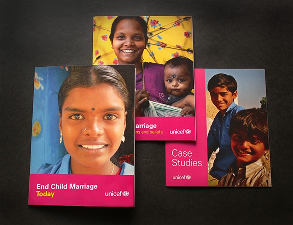
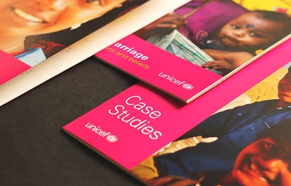
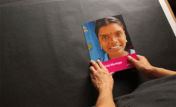
2. Striking, Engaging Photography - UNICEF
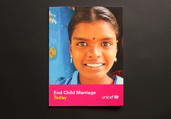
This UNICEF press kit by Tushar Ghei includes pamphlets and booklets which were produced for their work with the Indian Government to end child marriage. Not that you’d know it from the personal and engaging portraits on the covers and inside.
With the smiles and straight-to-the-lens looks from the models, we see how the lives of children should appear. Everyone can empathise with the happy feeling the young faces are clearly experiencing.
It evokes memories of our own childhoods; games in the park, summer holidays and secretly enjoying school because of how long you get to spend with your friends.
But the title, End Child Marriage Today, brings home the plight of Indian children being forced into marriage at their tender years.
Such a powerful juxtaposition is made so effective thanks to the now-no-longer hopeful, young faces which dominate the page. Those same smiles which prompted us to remember our own happy childhoods take on a much more emotive angle.
And getting hold of your reader’s emotions is the best way to achieve leaflet success.
3. Interactive Engineering - Sheffield City Region
.jpg?width=600&name=31W%20-%20Sheffield%20City%20Region%20(2).jpg)
.gif)
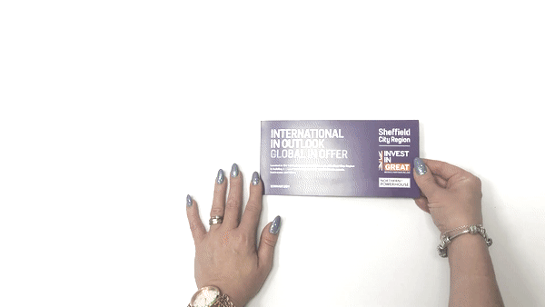
Initially, this looks like a pretty straightforward leaflet. Take a closer look and readers realise that this is an interactive leaflet that uses innovative cardboard engineering to really grab someone’s attention.
The leaflets were used at an international real estate event which influential people from all over the world attended. No matter where the guests came from, they all enjoyed the surprise within as they pulled the tab to reveal the sliding pages.
This is a great example of the benefit of trying something new. It shows that even though print marketing has been around for hundreds of years in one form or another, there’s always a new approach you can try to impress your audience.
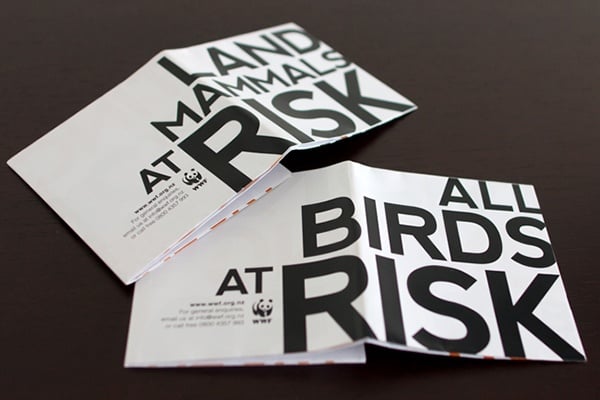
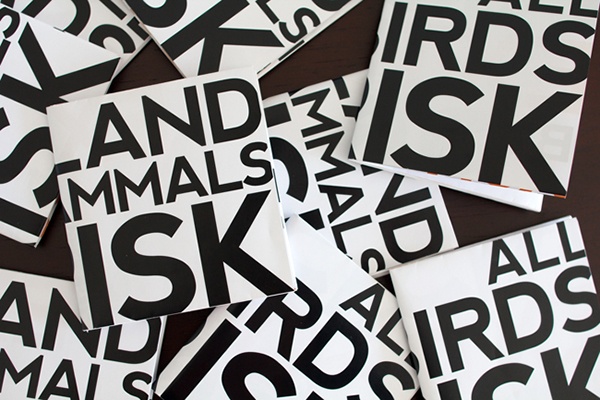
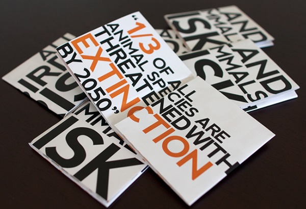
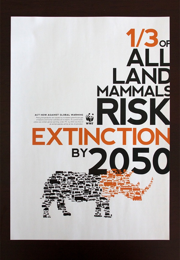
4. Big, Bold, Clever Typography - WWF
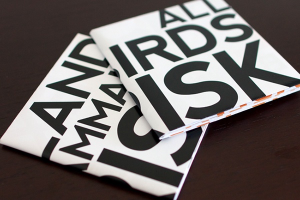
This leaflet, by Raewyn Brandon for WWF, is perfectly designed to highlight the startling problems we face due to climate change.
The simple way that a contrasting black on white colour palette is balanced with an elaborate layout. The font size and page folding method also mean that the reader can’t help but become engrossed.
It grabs your attention even when it’s folded. Then as you unfold it and the statistics become clear, you’ve invested time in the leaflet.
The bold typeface and clear messaging mean that this leaves the reader a whole lot more likely to remember the message.
These examples of leaflets all show different ways to grab your audience’s attention.
WWF chose to let the typography and size of their message do the attention-grabbing. UNICEF played around with our emotions through imagery and juxtaposition. Hope City Church intrigued us with their unique layout whereas Sheffield City Region provided their readers with an interactive experience which also offered something informative.
You Can Produce Brilliant Leaflets Like These
All you need to do is know how to choose the right print methods and materials to bring your creative ideas to life. Get up to speed with all you need to know in this handy guide...