It's your chance to create that lasting first impression, so go all out and grab that attention, snatch the readers' focus away from your competition by considering every aspect of a brochure to make it look luxurious. Here are tips on how to come up with a professional brochure design.

Remember, the more effort you put into your brochure design, the more impressed the reader will be. Handing out a small business card or a poorly-produced leaflet probably won't give you the results you want. The tips you should take on board to create a luxury brochure design include:
- Perfect Your Layout
- Choose Your Images Carefully
- What to Do With Your Written Content
- The Stock You Should Consider
- Why You Need The Perfect Print Technique
Tip #1: Perfect Your Layout
A luxury brochure should always feature a unique layout, and breaking this down into three steps will make it easier to plan out the brochure beforehand.
- Consider folding options to match the tone of your brand. Never go overboard and create a puzzle that the reader can't decipher because they'll put it down - despite the creativity. Sometimes, simplicity is key so make sure any folds you choose to have fit the tone. For example, you wouldn't expect Rolls Royce to be folding their luxury brochures, they'll stick to tradition and have a booklet-style to advertise their high-end products. But, on the other hand, hotels, spas and clothing brand could benefit from more creativity with their folding options to make the brochure feel more immersive.
- Next, choose a consistent colour and font scheme. It's vital you pick these out early because changing right before a printing stage could result in a complete re-design. Play around with several colours and fonts beforehand which you think will suit your brand and enhance the appeal of your products. Having a handful of colours and fonts makes it much easier to read, while it also helps your brand become instantly recognisable in the long-run. Don't be too obscure and go with a bright pink cover with yellow polka dots. It's not the 90s and you're not Mr. Blobby. Again, keep your brand and the tone in mind for a sleek and simplistic finish.
Dark, matte tones of black and navy contrasted with whites and silvers convey premium quality easily. And modern, clean, Sans-serif front can be paired with elaborate calligraphy fonts to create a luxury-looking typeset. - The sections are important too, so plan out what you're going to include and where. Don't confuse the readers by jumping ahead where they'll fail to keep up. If you're advertising premium watches, create a lookbook where you can keep all of the designs and options closer together to keep readers more engaged. If you're a spa, then focus on each service before moving on to the next.
Tip #2: Choose Your Images Carefully
Images are the key to success in any brochure. Your brochure needs to include powerful images that represent or directly advertise your premium products - and keep them specific to your industry.
Put effort into the images. If possible, avoid using stock images and purchase a camera to take your own which instantly become unique to your company. Make sure you fiddle around with the settings so that they help show off your products in your brochure in the best way. This includes eliminating red eye, staying in focus to make products appear sharper along with taking images in the highest possible resolution so they're not pixelated or blurry. If necessary, hiring a professional photographer for this could be well worth the investment.
Use different angles of the images you're going to include in your brochure, so they're not always the same and appear two-dimensional. Fill the frames by getting up close and personal to accentuate all of the small details that make all of the difference and think about composition too.
Think about it, if there's anything distracting in the image you've placed in your brochure, your premium products aren't going to be stealing the limelight. And if there's extra room in your brochure, consider using partner or media logos, or even testimonials to enhance the reputation of your brand.

Tip #3: What To Do With Your Written Content
Obviously, every brochure needs written content because as appealing as visuals are, readers need some information on the messages you're trying to get across. While using powerful images really hit home the quality of your products, adding some content to your brochure to highlight the products is a beneficial way of engaging readers.
Now, nobody has the time to sit through and flick through a novel-length brochure. So, avoid waffling on about things that won't add any value and keep it straight to the point. However, don't give everything away either in the text, entice them to finding out more, so a subtle call-to-action should be added.
That said, be sure to give them enough information inside of the brochure to want to take you up on your call-to-action. This could be a book a visit or tour, request a sample or even a request a quote.
Tip #4: The Stock You Should Consider
Premium brands don't just incorporate all of the above points into their brochures, they go above and beyond. Why will Tag Heuer want their brochures feeling exactly the same as an Argos catalogue? So, you should also think about the stock you're going to use. To chase that luxury finish, use luxury papers that are specially-designed to help take brochures to that next level.
If a brochure feels poor quality, readers are going to put it down before they've had a chance to absorb the message. All of that hard work on photography, layout and content can be ignored thanks to an inferior stock (paper) choice. Four potential luxury papers you should consider using are:
- Lux - Beneficial to classic products, such as older cars, watches and hotels. The material is an ultra-thick, triple layered card which features a signature coloured core running through the centre layer. By using Lux with a suitable printing technique, you'll be able to experience the true texture of the paper and enjoy the understated, classic appearance.
- Constellation Snow - This stock comes in a high, white uncoated paper and card with an embossed linen effect. Constellation Snow provides a textured effect which is used in more deluxe brochures.
- Silk - Silk coated paper has a low surface sheen and a truly luxurious feel, while providing excellent ink-to-paper contrast. This coating makes colours in your brochure appear a lot brighter and more defined while maintaining readability.
- Uncoated - Uncoated paper has a soft and tactile quality which will feel nice in the reader's hands. As this is more absorbent than coated paper, the inks appear much flatter on this modern choice. If the right printing technique is used, this stock will help your brochure as it produces a sharper and more defined finish. It also features more vivid colours that assist in making premium products stand out.
Tip #5: Why You Need The Perfect Print Technique
You and your design team might have created the greatest luxury brochure that's ever existed - but don't pick a poor printing technique and let all of that effort go to waste. Finalise the process and solidify the luxury feel by taking into account a technique like LED UV printing.

LED UV printing is the most beneficial method to use - especially with the stocks mentioned above - because it's great on a wide range of paper and other materials. Its quick-drying process means the end products are consistently perfect with no markings or blemishes, and the turnaround times are also quick so you don't have to wait around forever.
You won't have to compromise on quality, especially since the colours remain more vivid, brighter and sharper to enhance the fine details as the ink doesn't sink into the materials. While all of the luxury papers mentioned above can create a premium brochure, uncoated stock is best when used with an LED UV printing machine.
What Is A Professional Brochure & Why You Need One
Let's think about it this way. If you head over to the Audi website, the only way you're getting a brochure is if you fill in your details and request one. You don't find them gathering dust in the corner shops, they're in the showroom and that's because they're considered luxury. At the other end of the spectrum, you'll find those ten-a-penny brochures or leaflets advertising used cars that people don't usually look at twice.
Readers instantly expect high quality when a brochure isn't instantly available, they expect perfection and a luxury brand is expected to deliver that consistently. That means not overloading with text, using only the best images possible along with the feeling of the brochure.
It doesn't have to be a car brand like Audi, it can be an exclusive restaurant, a spa, watchmakers, jewellery store or anything else people consider to be premium. These types of products and services need to be shown off in that way.
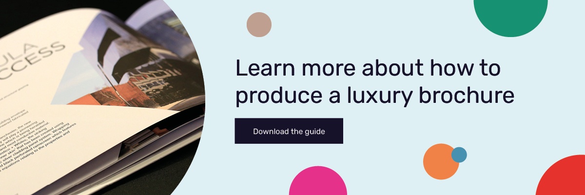
Take All This Knowledge (And More) With You For Free
All of those tips can be a lot to remember. That's why we've put them all together - with some extra help too - inside one easy-to-read download.
Our guide, How To Produce A Luxury Brochure, covers everything you need with full explanations. Just press the button below to get your copy.