From the bright colours and the amazing fonts to the stunning images and quality content, event brochures should make a big impact. But there needs to be a balance between impactful and informative. Here are five brochure design for events ideas to inspire you.
-934495-edited.jpg?width=600&height=300&name=Sheffield%20Students%20Union%20Week%2013%20(1)-934495-edited.jpg)
Because they're usually for one-off or occasions that don't happen very often, you can afford to be more unique and creative with your event brochures. The key things you should remember when designing are (and you can click on these headings to be taken to the relevant section):
-
Have a Killer Front Cover
-
Use Bite Sized Chunks of Text and White Space
-
Play With Colour and Fonts
-
Never Underestimate the Power of Lists
-
Experiment With Folds
Have a Killer front cover
No matter what the purpose behind the brochure, the front cover should always be eye-catching and attractive. After all, the cover's purpose is to encourage your audience to pick up the brochure in the first place.
Ensure that you use striking fonts, bright colours, and attractive images and graphics. You don't need to worry about text here - you just need a few choice snippets about your event to engage the reader and get them excited.
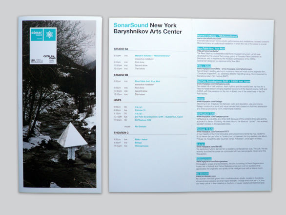
For instance, the brochure below features lots of white space (which we'll be discussing in the next point) and only two colours used. But despite its simple design, it's very 'clean', eye-catching and reveals just enough to intrigue the reader.
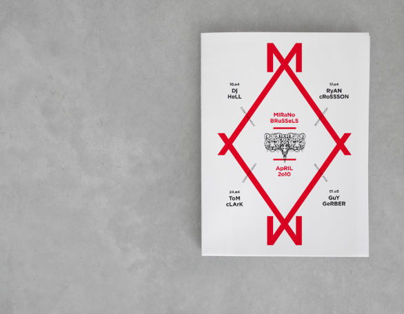 Designed by Pam & Jenny. Credit
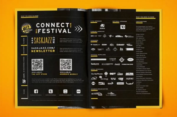
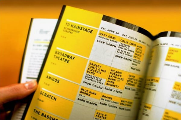
Use Bite sized chunks of text and white space
Although an attractive brochure cover will get people to pick it up, if it's not informative, what's the point? Your brochure should be as informative as it is attractive, but it should be presented in digestible 'chunks'. Make full use of white space to help break up your chunks of text.
For example, you need to have an events timetable or schedule. But rather than posting them one after the other in a dull list or walls of text, consider presenting them in a calendar-like layout. This makes it much easier to read. You can always write more about a featured act/stand on another page further into the brochure. Just remember to direct your readers to it with enticing lead-in text.
You also need to include contact details for press releases and other queries, links to your website or social media pages and a QR code for your app (if you have one).
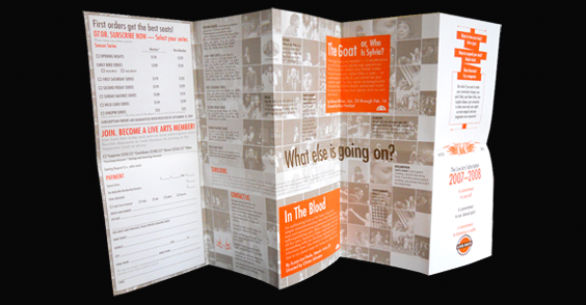
Just take a look at this example below, which embodies all of this in one events brochure. The information is presented in chunks to make it easier to read. Logos, graphics and plenty of white (in this case coloured black) space help to break up the bodies of text.
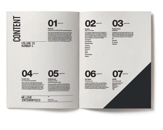
Or, you could go for something even more simple. This example below shows us the power of clear signposting with big, bold numbers and plenty of white space - the monochrome palette is also a great example of when less is more. Speaking of which...
Play with colours and fonts
Two of the easiest ways to ensure that your brochure commandeers attention is to use eye-catching colours and fonts. Colours should be contrasting yet not look out of place next to the images. Nor should they detract from the overall design.
Fonts should be unique but still fit with your event's branding or image.
For example, B&B Press have been producing the events brochure for Sheffield University's Varsity, a student sport event, for three years.
Our latest design featured four core colours on the front page, which matched the colours of the sports uniforms. The font used was a classic American collegiate typeface. This resulted in an understated but attractive and effective brochure.
.jpg?width=600&name=Sheffield%20Students%20Union%20Week%2013%20(1).jpg)
Never underestimate the power of lists
Your brochure should be informative, but that information should be laid out in a way that makes your audience actually want to read it. This is where lists come in. Lists allow your readers to skim quickly through your brochure until they find something that interests them.
However, the thing about lists is that they tend to be brief so make sure you only use them where appropriate. For example, lists are great for providing 'snapshots' of events. If you want to go into more detail about a featured act, indicate to your audience that they can read more about it on a particular page.
This example below demonstrates the combinational power of lists, white space and pops of colour. The stripped back aesthetic means the reader's eyes aren't distracted and only look at where they need to be - which is exactly what your event brochure should be aiming for.
Experiment with folds
Consider experimenting with different types of folds and the size of your brochure. Bi fold and tri fold brochures aren't the only style you can go for - although they are classics. Be bold and try something different, as long as it aligns with your event's aesthetic.
For example, brochures designed to be opened up like broadsheet newspapers would be ideal for arty conventions such as art shows, festivals and exhibitions.
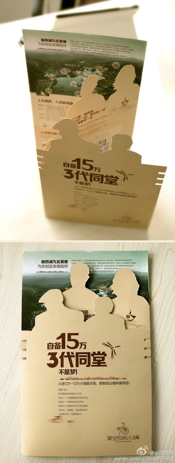
Or, you could give the classic tri fold brochure an edge by having unique cutout details - like the example below.
When it comes to designing an event brochure, your main aim should be to create lasting impact but still retain the informational aspect. After all, a well-designed brochure may be pretty and entice people to pick it up, but if it doesn't offer any useful information, what use is it? It's all about that balance.
Want to Produce a Luxury Brochure?
Make sure your next brochure really grabs your audience's attention by getting the design and content nailed, and then using the right printing technique.
Check out our free download which helps you do this perfectly...